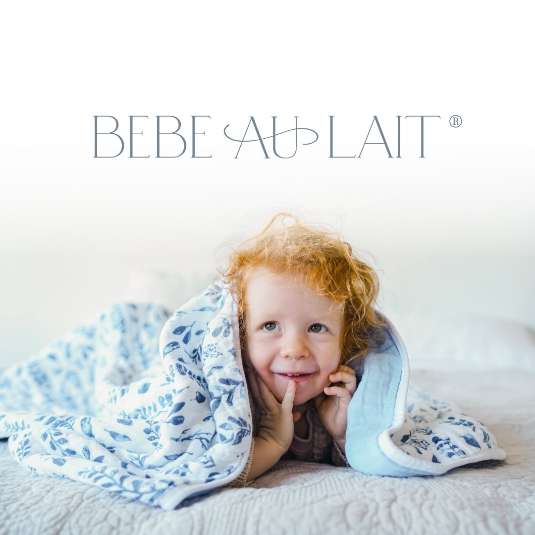
Bebe au Lait
Bebe au Lait was established in 2004.
They remain a favorite for parents worldwide with a growing selection of deluxe products that can be found online, in boutiques across multiple continents and at Target.

Logo Refresh
I used elements from the preexisting logo that needed a more cohesive purpose. The original background swirl was used to convey the feeling of flow and softness that Bebe au Lait’s 100% pure muslin material creates, so bringing it over into the new design felt like a good fit.

Color Palette
We wanted to move towards a more organic and gender neutral feel through prints and colors. The softly woven muslin fabrics needed to be represented by a grounded and inviting palette, that was a nod to the whimsy and nature used in many of the prints.

Photography Direction
Keeping a minimalist approach, so that the prints and products would really catch the viewers eye was essential. They tell the story of Bebe au Lait, a baby brand that makes parenting more stylish in a very accessible way.

Packaging Design
Using solid color blocking and an abundance of white, we are in the process of establishing a consistent design across hundreds of products.

Digital Outreach
Establishing a consistent foundation for Bebe au Lait’s followers and vendors is key. Ensuring that a brands heartfelt intent and quality shines through, is always my goal.
